suptitle
The CMS
We chose the PHP framework Laravel for the development of the backend. By using Object-Relational Mapping (ORM), database objects can be managed efficiently, which considerably simplifies the development processes.
The Studicash portal enables administrators to comprehensively manage all content. New job offers can be published in no time at all. A particular highlight of the backend is the analysis of applications for advertised positions. Detailed statistics show how many users have applied for an advert. Based on this information, the administrator can react directly and send applicants an acceptance or rejection via the system.
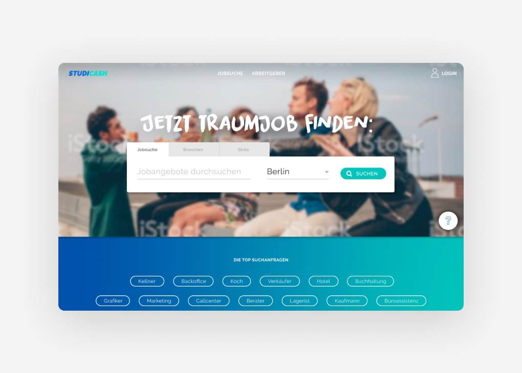
The start page of the job portal
The start page welcomes users with a target group-specific image and a registration box. Three registration options are available here:
- Registration via the website
- Registration with Facebook
- Registration with XING
When registering via Facebook, one click is all it takes for the system to automatically create a new profile.

The registration
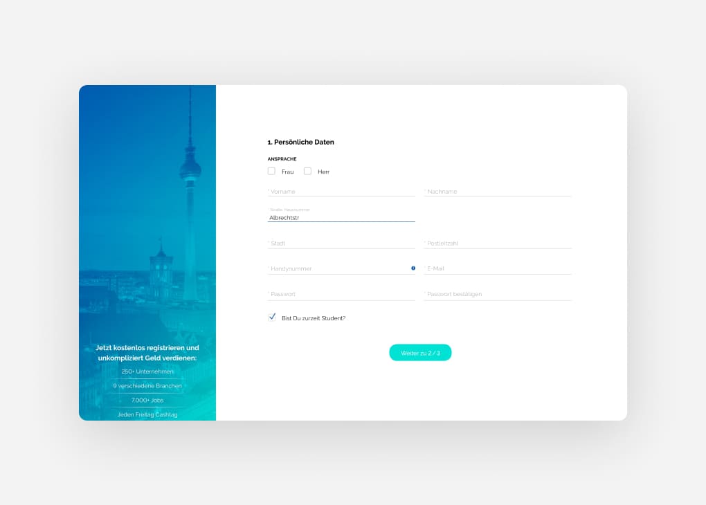
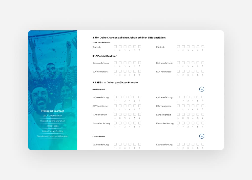
A simple and user-friendly UX is at the centre of the registration process. The template extends across the entire width of the screen (full-width) and does not have a centred grid.
The left-hand column offers space for benefits and testimonials, while the user goes through the registration process on the right-hand side:
- Select the relevant sectors
- Entry of personal data
- Display of suitable skills based on the industry selection
The job overview
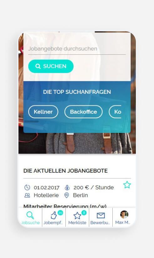
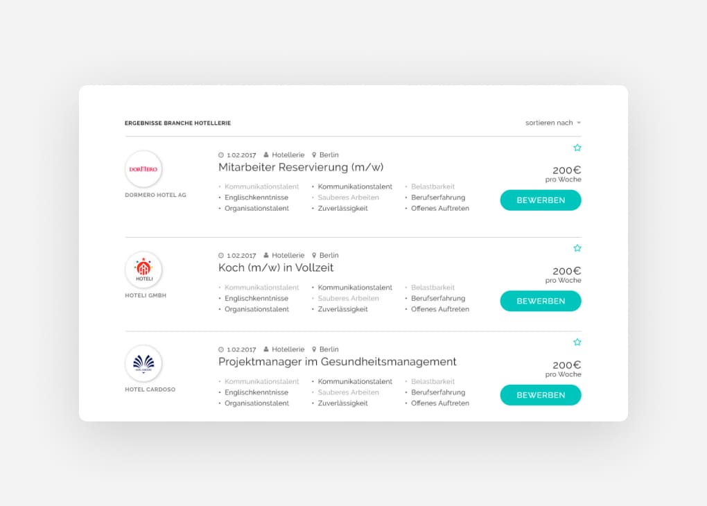
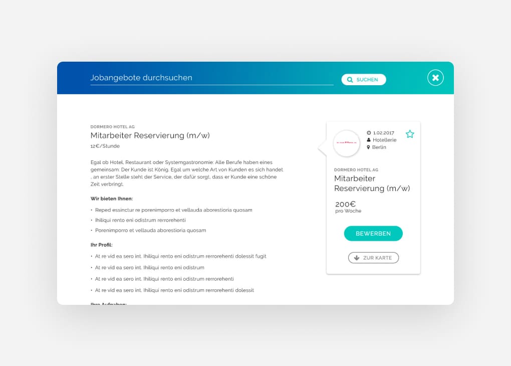
The job page begins with a large search field in which the user has various search options: a full-text search, the use of predefined search queries or the option to filter by industry in another tab. The details of the individual job offers are displayed dynamically as a slide-in. This allows the user to view all job offers quickly and without loading times with just a few clicks.
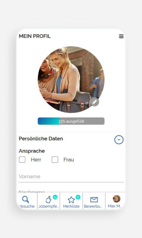
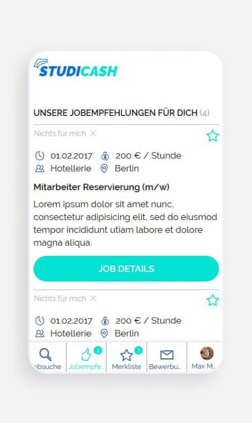
Navigation in the mobile view
